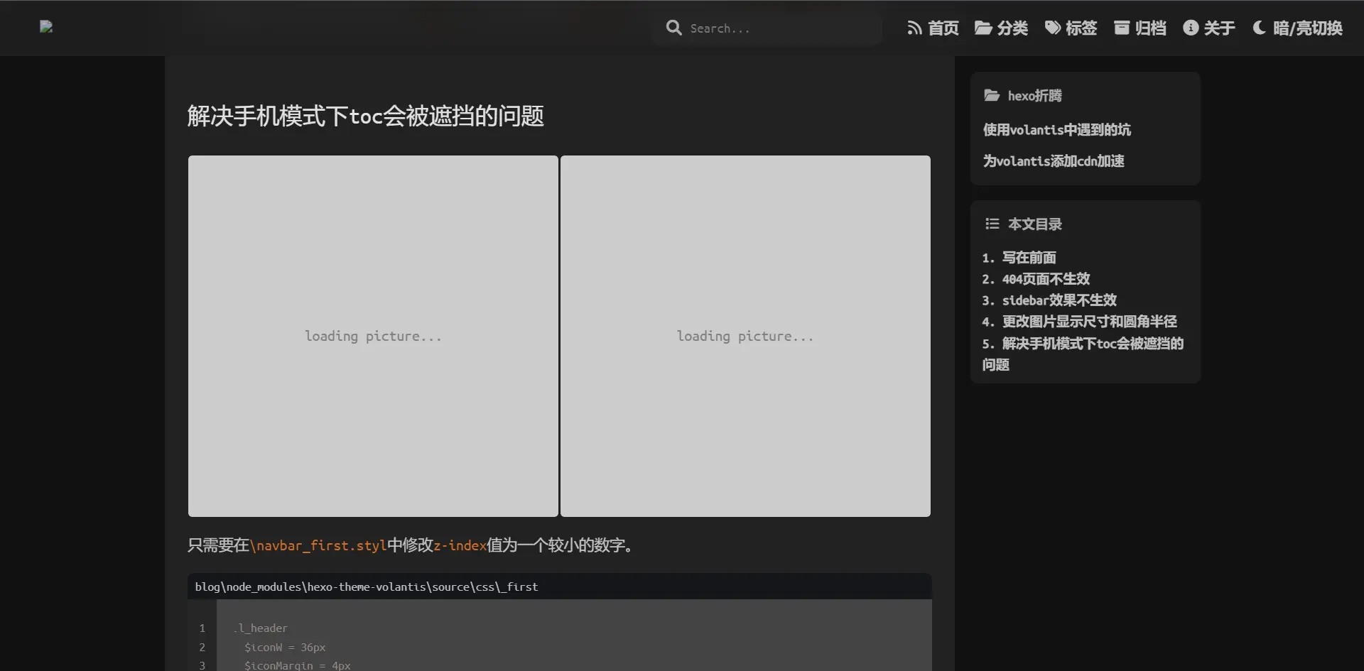
我们要得到的结果如封面所示
由于博客采用了图片懒加载(lazyload)插件,在加载 dom 后和图片加载成功之前,图片占位图为 1px 的像素,图片加载成功之后,则会把布局撑开,造成布局抖动。如果把和要加载的图片(本博客所有图片都放在了 GitHub 图床上,所以要用到 image-size 库访问远程图片)一样大小的占位图替代 1px 大小的占位图,则能解决布局抖动问题。本 post 将会占位图以硬编码的方式写到 dom 中,这需要修改在生成 hexo 博客时会用到的 fancybox.js(或许每个主题用到的文件里都不一样,但最终都会使用 hexo.extend.tag.register() 方法;本博客使用 volantis 主题)。
为图片添加占位图的基本结构
以全宽图片为例:
<div style="position: relative; width: 100%;"> <!-- padding-bottom设置占位图大小 --> <a style="position: relative; height: 0; padding-bottom: ${h_divide_w_str};color:gray;background-color: rgb(204, 204, 204);" > <!-- 占位图中的文字 --> <div style="position: absolute; left: 50%; top: 50%;transform: translate(-50%, -50%);" > loading picture... </div> <!-- 图片 --> <img /> </a></div>其中 position、width、height、padding 为必要属性,${h_divide_w_str} 为占位图的 宽高比。因为需要解决布局抖动问题,所以占位图的 宽高比 要与图片一致,如何动态获取 宽高比 呢?这需要在生成 hexo 博客之前获取,然后代入到 ${h_divide_w_str} 中。
volantis 主题动态获取远程图片的宽高比
Note
有些时候可能读取不了图片就出错,可以试多几次就没有问题,或者自己写一个失败重试的代码
在编写博客的时候用到了 gallery 标签插件,这个插件可以在点击图片的时候放大(这是由 fancybox.js 和 fancybox.css 驱动。注意: 这里的 fancybox.js 是 JavaScript 文件,而生成 hexo 博客用到的同名文件是 Nodejs 文件)
我们需要修改的,就是生成 html 对应的文件,而生成 gallery 的文件位于 blog\node_modules\hexo-theme-volantis\scripts\tags\fancybox.js(nodejs 文件)。
点击链接可以下载我修改好的 fancybox.js
以下是使用 image-size 库访问远程图片得到 宽高比 的代码示例。
const url = require('url')const http = require('http')
const sizeOf = require('image-size')
const imgUrl = 'http://my-amazing-website.com/image.jpeg'const options = url.parse(imgUrl)
http.get(options, function (response) { const chunks = [] response .on('data', function (chunk) { chunks.push(chunk) }) .on('end', function () { const buffer = Buffer.concat(chunks) const dimensions = sizeOf(buffer) const h_divide_w = (100 * dimensions.height) / dimensions.width const h_divide_w_str = h_divide_w.toString() + '%' //宽高比 })})修改宽高比
得到 宽高比 后自定义 css 样式,以下以 volantis 主题为例
const result = `<div class='fancybox' style='position: relative; width: 100%;'> <a class='fancybox' pjax-fancybox itemscope itemtype="http://schema.org/ImageObject" itemprop="url" href='${url}' data-fancybox='${group}' data-caption='${alt}' style="position: relative;background-color: rgb(204, 204, 204);border-radius: 4px; padding-bottom: ${h_divide_w_str};color:gray;"> <div style="position: absolute; left: 50%; top: 50%;transform: translate(-50%, -50%);">loading picture...</div> ${newItem} </a>${buidAlt(imageTags || alt)}</div>`Warning
此代码只是实例,不同主题的 class 和变量名称可能不一样
因为是获取图片 宽高比 异步进行的,所以要在 hexo.extend.tag.register() 方法中添加 async: true 以堵塞博客的生成,这样才能在得到 宽高比 后生成博客。此方法点击以下链接查看更多。
hexo.extend.tag.register('gallery', postFancybox, { ends: true, async: true })其中 postFancybox 是返回值是 promise 类型。(点击以上的 hexo 标签插件(Tag)查看更多)
如果在一个 gallery 内有多个图片,或许需要用到 for 循环,那么需要 promise.all() 确保所有占位图生成完成后再生成网页。
修改 fancybox.css
hexo 的 css 是用 styl 编写的,而 volantis 主题的 fancybox.css 位于 blog\node_modules\hexo-theme-volantis\source\css\_style\_tag-plugins\fancybox.styl。
点击链接查看更多
主要就是把影响自定义 css 的 height 属性删去(我大概也忘了修改过什么了,,,)。
添加动画
将 html 代码添加到 fancybox.js 对应位置就能得到以上效果
<svg class="spinner0" viewBox="0 0 50 50"> {' '} <circle class="path0" cx="25" cy="25" r="20" fill="none" stroke-width="4" ></circle></svg>然后修改 css 样式
.spinner0 { animation: rotate 2s linear infinite; position: absolute; top: 50%; left: 50%; margin: -25px 0 0 -25px; width: 50px; height: 50px;
& .path0 { stroke: var(--color-list-hl); stroke-linecap: round; animation: dash 1.5s ease-in-out infinite; }
}
@keyframes rotate { 100% { transform: rotate(360deg); }}
@keyframes dash { 0% { stroke-dasharray: 1, 150; stroke-dashoffset: 0; } 50% { stroke-dasharray: 90, 150; stroke-dashoffset: -35; } 100% { stroke-dasharray: 90, 150; stroke-dashoffset: -124; }}
// 加载图片后暂停动画.spinner0:has(+ img.loaded){ animation-play-state: paused; > circle { animation-play-state: paused; } }